Save About 2 Hours Per Clinician With EMR Problem Based Summaries
· 12 min read

Save About 2 Hours Per Clinician With EMR Problem Based Summaries
A problem-based summary organizes a patient’s chart around active diagnoses instead of chronological notes, pairing each problem with its latest assessment, plan, meds, and labs. That structure cuts the time clinicians spend hunting through scattered notes and directly supports follow-up and handoff. Peer-reviewed evidence links problem-oriented charting to better outcomes and provider behavior, and implementations like MedScrub’s work with Monarch Health show what a turnkey rollout looks like in practice.
TL;DR:
- Effective problem-based summaries rely on a clean, consistently updated problem list for accurate assessments, plans, and linked data across diagnoses.
- Deployment success depends on careful governance, targeted pilot programs, clinician champions, and integration into existing workflows to ensure adoption.
- Interface patterns like multi-panel layouts, dynamic views, and concept maps can significantly improve usability and clinician trust in problem-oriented charts.
- Automated summaries with nightly chart prep can save clinicians roughly two hours per day in high-volume or complex cases, but trust depends on data privacy and proper integration.
- Overly bloated summaries or unchecked problem lists undermine their purpose, so limiting detail and enforcing governance are critical to maintaining lean, useful information.
Table of Contents
- What Is a Problem-Based Summary, Structurally?
- Does Problem-Oriented Charting Actually Improve Outcomes?
- What Interface Patterns Make Problem-Based Summaries Usable?
- How Do You Roll Out Problem-Based Summaries in an Existing EMR?
- How Do You Keep Problem-Based Summaries From Becoming Note Bloat?
- How Do You Measure Whether Problem-Based Summaries Are Working?
- How Did Monarch Health Deploy Problem-Based Summaries With MedScrub?
- When Automated Summaries Help, and When They Don’t
- Why Medscrub Fits Clinics Ready to Automate Problem-Based Summaries
- Sources
- FAQ
What Is a Problem-Based Summary, Structurally?
A problem-based summary isn’t a narrative recap. It’s a data structure built around the patient’s problem list, with everything else attached to the relevant diagnosis rather than floating in a chronological note.
The core anatomy usually includes:
- A live problem list with a short status line per problem (active, resolved, worsening)
- The most recent assessment and plan tied to each problem
- Linked medications, labs, orders, and relevant note excerpts for that specific problem
- Structured codes (SNOMED CT, ICD-10, RxNorm, LOINC) paired with extracted text pulled from free-text notes
SOAP notes still matter here. The assessment and plan (A/P) section of a SOAP note is the natural home for problem-level updates, and a well-maintained problem list is what lets that A/P map cleanly to structured data downstream. If the problem list is sloppy, duplicated, or full of stale entries, every clinical decision support (CDS) tool and every summary built on top of it inherits that mess. Problem-list hygiene isn’t a nice-to-have; it’s the foundation the entire summary depends on.
Does Problem-Oriented Charting Actually Improve Outcomes?
Yes, and the evidence is more specific than most vendor pitches suggest. A scoping review of 38 studies found that problem-oriented elements in electronic health records correlate with reduced mortality, shorter hospital stays, fewer admissions, and better chronic disease management, and 30 of those studies documented measurable changes in provider behavior, not just patient results.
The behavioral shift shows up clearly at the point of care. One study tracking 3,650 patient records before implementation and 4,344 after found that problem-based charting increased the average problems logged per encounter by 2.18, a jump of more than 50%, with improved recall for specific diagnoses that had previously been undercharged.
The catch: these gains are usage-dependent. A problem list that clinicians don’t trust or don’t update reverts to being decorative. Adoption and workflow design determine whether the structure pays off or just becomes one more field nobody fills in.
What Interface Patterns Make Problem-Based Summaries Usable?
Structure alone doesn’t win clinician trust. The interface has to make the problem-oriented data faster to use than the old chronological note, or people route around it.
Three patterns show up repeatedly in successful deployments:
- The 3-column toolkit. One commercial EHR implementation used a three-panel layout, problems on one side, linked data in the middle, note-building macros on the other, and saw usage climb from a slow start to tens of thousands of visits across departments once the design settled.
- Dynamic problem-oriented views (POV). Rather than a static list, the POV re-sorts and filters by recency, severity, or specialty relevance, so a cardiologist and a primary care physician looking at the same chart see different priority orders.
- Problem concept maps (PCMs). For common chronic conditions like diabetes, a problem concept map built on SNOMED, RxNorm, and LOINC automatically pulls the relevant meds, labs, and imaging tied to that specific problem, no manual searching required.
Beyond the big three, the features that actually get used day to day are smaller: quick filters by date or severity, a copy-last-A/P shortcut so clinicians aren’t retyping stable plans, linked meds and labs attached directly to the problem, recipient-specific views for referrals, and a one-line overview per problem instead of a paragraph.
Pro Tip: Tie every medication on the list back to the problem it treats. An unlinked med list is one of the fastest ways to lose clinician trust in an automated summary, because nobody can tell why a drug is still on the chart.
How Do You Roll Out Problem-Based Summaries in an Existing EMR?
Rolling this out inside a live EMR is a governance project as much as a technical one. Skipping the governance step is the single most common reason pilots stall.
- Assign ownership of the problem list. Someone, usually a clinical informatics lead, needs authority over mapping rules, deduplication policy, and what counts as an “active” versus “resolved” problem.
- Design a narrow pilot. Pick one specialty with a clear, common workflow (primary care and diabetes management are common starting points), and build problem-oriented templates (POTs) specific to that use case.
- Integrate into the existing note workflow. Don’t bolt the summary on as a separate screen; embed it where clinicians already document, using SmartLinks, macros, or equivalent tools in your EMR.
- Recruit clinician champions. A handful of engaged early adopters who give fast feedback will surface usability problems faster than any formal review committee.
- Run short training sessions, not long ones. Five-minute walkthroughs during existing huddles beat hour-long onboarding sessions that people forget by the next shift.
- Handle the technical mapping. Map local problem codes to SNOMED, ICD-10, RxNorm, and LOINC, decide on your privacy model (on-device de-identification if any AI processing touches the data), and set a realistic deployment cadence, department by department rather than all at once.
Evidence backs the incremental approach: a four-year hospital-wide rollout of digital problem-oriented notes found that incremental rollout, consistent design, and continuous monitoring supported adoption across specialties, even though satisfaction scores varied by department. That variation is normal. Plan for it instead of treating it as a failure signal.
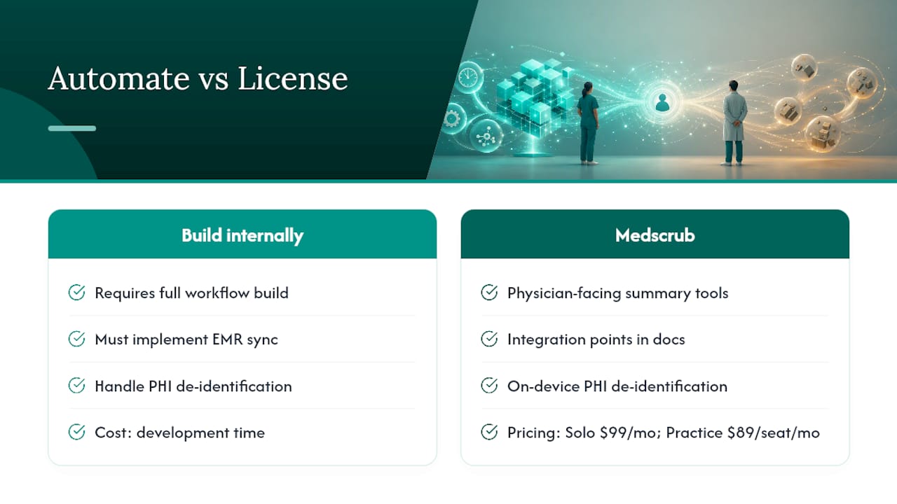
For clinics evaluating whether to build this internally or license it, MedScrub’s developer documentation covers the API and integration patterns that map directly to this checklist.
How Do You Keep Problem-Based Summaries From Becoming Note Bloat?
The irony of problem-oriented documentation is that it can become just as bloated as the chronological notes it replaces if nobody sets limits. A summary that dumps the full history under every problem defeats the purpose.
A few rules keep it lean:
- Write one line per problem for the overview, and reserve full detail for a click-through, not the default view.
- Highlight only what’s new or changed since the last encounter; stable, unremarkable data doesn’t need to resurface every visit.
- Build recipient profiles with modules for Reminder e Comunicazioni Automatiche - SMS WhatsApp Email | Gestionale per Studi Dentistici so a referral summary and an internal handoff pull different levels of detail from the same underlying data.
- Give clinicians control over what auto-populates into the note. Auto-fill is a convenience, not a mandate; forced full-history dumps drive clinicians right back to free text.
Research on automated EHR summarization backs this caution: current systems still struggle with redundancy, temporality, and salience, meaning few tools fully solve the problem of showing what matters and nothing else. Design has to compensate for that gap rather than assume the technology will sort it out.
Pro Tip: Run a two-week usability check with three or four clinicians before wider rollout. Watch where they click away from the summary back into the raw chart; that’s exactly where your filtering or highlighting is failing.
How Do You Measure Whether Problem-Based Summaries Are Working?
Pick metrics before the pilot starts, not after clinicians start asking whether it’s worth the trouble. A short, focused KPI set beats a long dashboard nobody checks.
| Metric | What it tells you | How to capture it |
|---|---|---|
| Problem-list utilization rate | Whether clinicians are actually using the structure | Percent of encounters with an updated problem list |
| Problems added per encounter | Documentation completeness | Compare pre/post rollout, as in the 2.18-problem increase study |
| Note-quality score | Whether summaries improve or degrade note quality | Periodic blinded chart review scoring |
| Clinician chart time | Efficiency gain or loss | Time-tracking or self-report during pilot weeks |
| Recipient satisfaction | Whether summaries help downstream care coordination | Short surveys to specialists or referral recipients |
A step-wedge design, rolling the feature out to different departments on a staggered schedule, lets you compare before-and-after data within each unit rather than relying on a single before/after snapshot for the whole organization. Pair the numbers with a short qualitative check-in every two to four weeks; clinicians will tell you what a chart time metric can’t.
How Did Monarch Health Deploy Problem-Based Summaries With MedScrub?
Monarch Health needed a way to walk into morning visits already knowing where each patient’s open problems stood, without an overnight admin scramble to prep charts. The deployment centered on nightly automated chart prep: MedScrub synced with Monarch’s EMR, generated problem-organized summaries overnight, and surfaced open care plans that needed attention before the clinician ever opened the chart.
What that looked like in practice:
- Overnight batch processing built problem-based summaries for the next day’s schedule automatically.
- Open-plan tracking flagged unresolved follow-ups (pending labs, overdue referrals, unfilled prescriptions) directly inside each problem’s summary.
- Clinicians reviewed a pre-built, problem-organized snapshot instead of reconstructing history from scattered notes.
The reported result was an average of roughly two hours saved per clinician per day, time previously spent piecing together chart history manually. Monarch’s own rollout lessons echo the broader literature: start with one clinic or specialty, fix problem-list quality issues before scaling, and keep iterating the summary layout with the clinicians actually using it, not just the IT team deploying it. The full Monarch Health case study walks through the rollout timeline in more detail.
When Automated Summaries Help, and When They Don’t
Automation earns its keep in high-volume clinics and complex chronic caseloads where the manual alternative is a clinician skimming ten pages before every visit. It earns less trust in low-volume, highly idiosyncratic cases where a human still needs to read the whole story.
Privacy design isn’t optional here. On-device de-identification or comparable governance matters more than any feature list if patient data ever touches a cloud model. Before adopting anything, check three things: is the problem list clean enough to trust, does the vendor’s integration actually reach your EMR’s data, and do you have a realistic plan for clinician buy-in beyond the pilot phase.
— Clint
Why Medscrub Fits Clinics Ready to Automate Problem-Based Summaries
This workflow involves EMR sync, automated problem-based summaries generated from existing chart data, and on-device PHI de-identification to ensure sensitive data remains local during AI-assisted preparation. 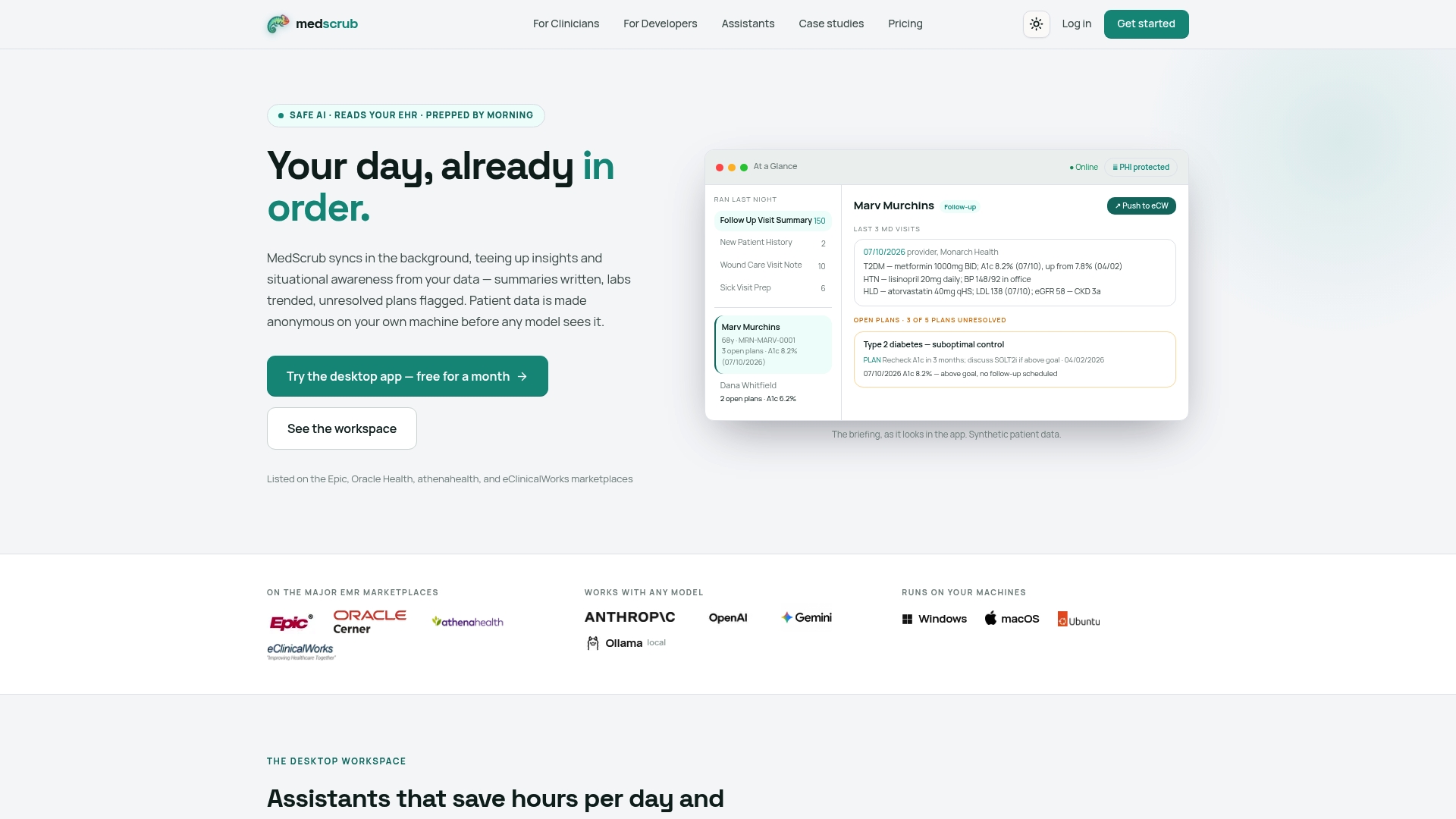
If your clinic is weighing whether to build this internally or license it, Medscrub’s physician-facing tools cover the summary and chart-prep workflow directly, while the developer documentation walks through integration points for technical teams. Solo practitioners can start on the Solo plan at $99 per month, and group practices scale with the Practice plan at $89 per month per seat. For a concrete look at results, the Monarch Health case study and the eSpiral case study both detail real deployments. Check the pricing page for current plan details, or start a trial to see how a nightly chart prep workflow fits your own patient volume.
This article is general information, not a substitute for advice from a qualified doctor. Consult a qualified healthcare professional about your own circumstances before acting on anything here.
Sources
- Problem-Oriented Electronic Health Records and Patient Clinical Outcomes: a Scoping Review
- Problem-oriented documentation: design and widespread adoption of a novel toolkit in a commercial electronic health record
FAQ
What Is a Problem-Based Summary in an EMR?
A problem-based summary organizes a patient’s chart data around active diagnoses rather than chronological entries, linking each problem to its latest assessment, plan, meds, and labs. It’s designed to speed up documentation review and support handoffs between clinicians.
How Long Should a Pilot Run Before Judging Results?
Most successful rollouts run pilots for several weeks to a few months within a single specialty before expanding, using a step-wedge design to compare departments as they come online. The problem-based charting study tracked thousands of records before and after activation to get a reliable before/after comparison.
Does Problem-Based Charting Actually Save Clinician Time?
Evidence on time savings varies by setting, but Monarch Health’s deployment with Medscrub’s automated nightly chart prep reported an average of roughly two hours saved per clinician per day. Separate research found template-based problem-oriented approaches improved note quality without adding to total charting time.
How Does Medscrub Protect Patient Data in Problem-Based Summaries?
Medscrub performs PHI de-identification directly on the clinician’s device before any AI processing happens, so sensitive data doesn’t need to leave the local machine. This is built to align with HIPAA and Safe Harbor requirements without requiring a separate BAA for the AI model vendor.
What’s the Biggest Mistake Clinics Make Implementing This?
Skipping problem-list governance is the most common failure point. If nobody owns deduplication, mapping standards, and update policy, the summary built on top of that list inherits every inconsistency and clinicians stop trusting it within weeks.


